Look UP! The Challenge
The Royal Society of Chemistry and the Higher Education institutions involved in this project are not liable for the actions or activities of any reader or anyone else who uses the information in these resource pages or the associated materials. We assume no liability with regard to injuries or damage to property that may occur as a result of using the information contained in these resources. A full risk assessment must be carried out before undertaking any of the practical investigations contained in this website and associated resources. We advise teachers to refer to either the CLEAPSS website or SSERC website for up to date health and safety information when planning practical activities for children.
All materials are ©Royal Society of Chemistry and the Higher Education institution responsible for setting the challenge and are freely available to share for educational purposes. Whilst educators are free to adapt the resources to suit their own needs, acknowledgement of copyright on all original materials must be included. Rights to original images included in the resource are for the use of the Royal Society of Chemistry and the Higher Education institution responsible for setting the challenge only – as such, these images may only be used as part of this resource and may not copied into or used in other materials.
When we measure air pollutants it is important to be able to spot the trends they show. For example, how have the levels of pollutants changed over the past 10 years? Or how do pollutant levels vary throughout the day? In this exercise, we will present graphs of data and ask you to look for any trends. If you’re feeling up to it, think about why these trends might be happening!
We will be looking at a range of pollutants including nitrogen oxides (NOx), ozone and particulate matter (PM).
NOx: we use this term to group together nitric oxide (NO) and nitrogen dioxide (NO2) as they have similar sources and behave in similar ways in the atmosphere. NOx is produced inside combustion engines when nitrogen and oxygen in the air react together due to high temperatures and pressure (under normal atmospheric conditions, nitrogen and oxygen don’t react together). NOx can be harmful to health and cause respiratory issues in humans. The NO2 component of NOx is acidic and so can also cause acid rain which damages plants and buildings.
Ozone: present naturally in the atmosphere in small amounts and very important in the breakdown process of other atmospheric pollutants. However, ozone can be emitted by (human activity). Too much ozone can cause many health problems.
PM: particulates are tiny pieces of solid suspended in the air. Although they come in many different shapes and sizes, we categorise them into 2 groups depending on their diameter – PM10 and PM2.5. The number is the size of the particle in micrometres (µm). Particles with diameters equal or smaller than 10 µm are called PM10. Particles with diameters equal or smaller than 2.5 µm are called PM2.5. You can get natural sources of PM (e.g. sand, sea salt) and anthropogenic PM (i.e. from car exhausts and bonfires). PM are so tiny that they can enter deep into the lungs and cause health issues.
A note on PM size:
A micrometre (µm) is a thousandth of a millimetre (mm).
A thick human hair is a tenth of a millimetre (0.1 mm).
This means PM10 (diameter =10 µm =0.01 mm) is a tenth of the diameter of a human hair.
To get you started, here’s a mini-challenge: which days of the year do you think are the most polluted and least polluted in the UK? Have a think and if you're not sure, ask us in the live sessions!
Now its time to spot some trends in data! Remember, none of these are desinged to be trick questions. Just look at the graphs and tell us what you see!
Let's start off with NOx.
This graph shows the daily average NOx level measured in the UK from 1990-2020 – what does this graph tell you about NOx levels over the past 30 years?
Why do you think NOx levels have gone down?
Now lets look at our local air quality near the University of Bristol!
This graph shows the daily average NOx level in Bristol in January 2000 and January 2020. Which year had higher levels of NOx pollution? Why do you think that might be? Do you notice anything else about the data?
This graph shows the daily average NOx levels measured in Bristol throughout 2020. Which months have the lowest NOx pollution and which months have the highest?
Here is a graph that shows the NOx concentrations in Bristol at different times of the day for the 25th March 2020. What does this graph show?
Why do you think we see increases in NOx pollution in the morning and evening?
Why do you think the peak in the morning is bigger than the peak in the afternoon?
Do you think this pattern would be different on a weekend?
Do you think we would see this pattern everywhere in the UK?
The following graph shows ozone (O3) concentrations in Bristol in July 2020.
Can you work out what the minimum concentration of O3 was?
Can you guess which days are the weekends? Feel free to use a calendar if you get stuck!
How are the weekends different to the weekdays in terms of O3 levels?
How might this data be different if we were looking at a winter month like November?
This graph shows ozone concentrations in Bristol across the whole of 2019. Can you work out the highest and lowest concentrations of ozone and when they were observed?
Why do you think we saw this maximum and this minimum?
Here is a graph showing the recorded data for ozone (O3) and NO2 in Bristol. What is different about this dataset?
Why do you think we see this gap in the observations in August 2019?
This graph shows PM concentrations in Bristol in 2020– why do you think there is more PM in the winter than in the summer?
Why do you think we get the large peaks in early November and at the end of December?
Remember to join us in our live sessions, we'll be answering any questions you may have about the data we've shown you!
Now you have had some practice spotting trends, it’s time to plot your own data!
Download the dataset using the link below and choose any of the capital cities in the UK to analyse.
Please click here to download your data
In this challenge, we will be asking you to look at air quality data for 2019 and 2020 and see how they differ. Can you guess how they may be different and why? (Hint: think about how the lockdown in the UK due to COVID-19 may have affected air quality!)
Our hypothesis for this challenge is that the 2020 data will show lower levels of air pollution than data from 2019 due to the impact of the national lockdown that began in March 2020. A hypothesis is what we call our best guess for what the data will show.
If you are not familiar with using Excel to plot graphs, then we have included a brief tutorial below to help! Remember, you can ask us questions about any of the challenges at the live sessions.
----------------------------------------------
This data will automatically be downloaded in excel format. Let’s use this dataset from Bristol as an example of how to plot your data.
The yellow box at the top of each sheet contains all the information about the measurement data including where it was collected, the methods used and the timings. You can ignore most of this box, the most important information is that in cell A1 – this is the site name and the year, in this case Bristol 2019.
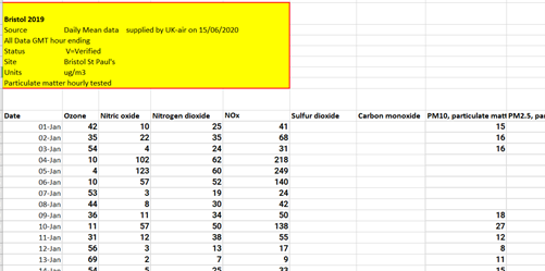
Your dataset contains measurements of O3, NO, NO2, NOX, SO2, CO PM10 and PM2.5.
Which pollutants would you like to look at? We are going to look at PM2.5 in our example, but you can choose any of the pollutants that are shown in your spreadsheet.
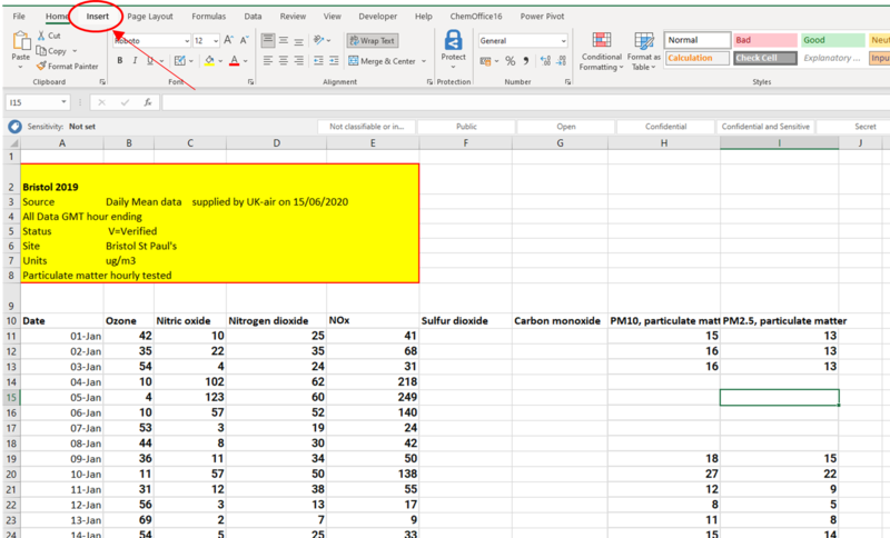
To plot your graph, you need to go to the ‘Insert’ tab in excel and click on this icon to plot a ‘scatter’ chart:
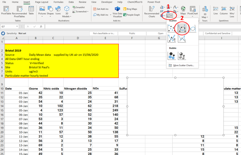
This will add a blank rectangle to spreadsheet (shown above). This is where you graph will be when you have selected the data.
Next, you need to plot the dates along the bottom of the graph – this is called the x-axis. You do this by double-clicking on the blank rectangle and then by clicking the button reading ‘Select Data’:
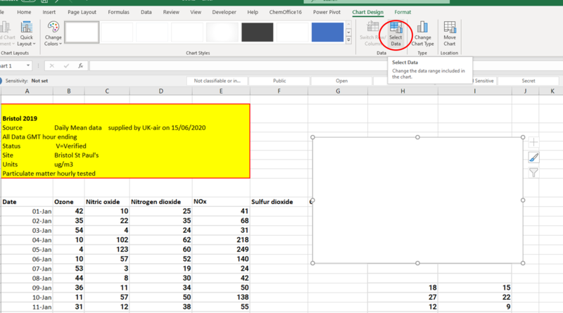
This opens a window that looks like this:
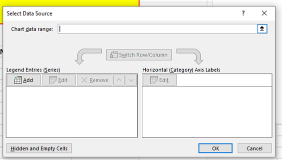
Click ‘Add’ to choose the data you would like to plot:
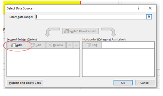
This will open this window:
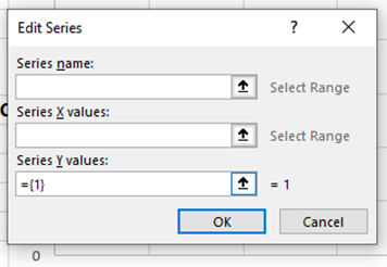
For your ‘Series Name’, you want to use cell A1 – this is the cell that contains the city name and the year.
You can select A1 by either pressing this button:

Then clicking on cell A1.
Next, we need to add the data for the x-axis. The x-axis is the line that runs along the bottom of the graph. We want the date to be on the x-axis for our graphs.
We do this by pressing this button
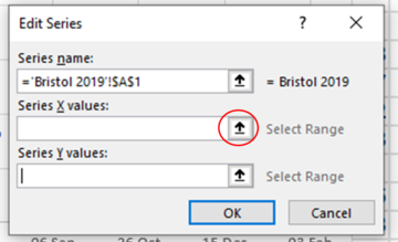
And then, starting at the 1st Jan (cell A10), we click-and-drag all the way down to the last day of the year, 31st Dec (cell A375). Then press this button:

This window will now look like this:
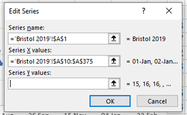
Now you have the x-axis sorted, you can add the data for your chosen pollutant by clicking this button similar to before:
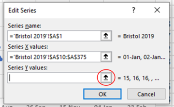
Then you click-and-drag along the data you would like to plot. In this example, we are looking at PM10 so we click and drag from H10 to H375. The ‘Edit Series’ window will now look like this:
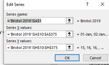
Remember, if you want to look at a different pollutant you need to use the correct column of data. For PM10, the data is in column H. For the other pollutants, data is in the following columns:
Ozone – B
Nitrous oxide (NO) – C
Nitrogen dioxide (NO2) – D
NOx – E
Sulphur dioxide (SO2) – F
Carbon monoxide (CO) – G
PM2.5 – I
Doing all this produces a graph that looks like this:
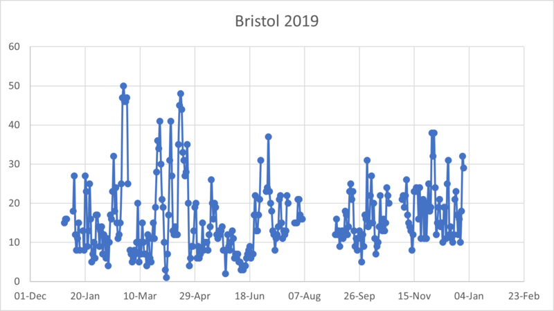
To add the 2020 data, you follow the exact same method as above. The only difference is that you need to make sure all your selections are from the 2020 sheet of your chosen city! All the sheets are listed at the bottom of the spreadsheet:
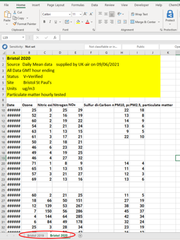
When you have plotted your 2019 and 2020 data on the same graph you are all finished!
Why not try to add some axis labels to your graph? Or change the design to your favourite colour?
Remember to join us in our live sessions, we'll be answering any questions you may have about the data analysis!
Now you have looked at your own data, its time to make some conclusions – can you see any of the trends discussed in Part I in your own data?
Why do you think your results look like they do?
Work in small groups or as a class and put your results into a PowerPoint presentation - how do your results compare?
Let us know what your results are in the ‘Let’s discuss’ section or at one of our live sessions!


